Hick's Law
BetterUp Report

This website's design clearly illustrates Hick's Law — the idea that the time it takes to make a decision increases with the complexity of choices. As we can see, there is not much going on within this homepage's view. First, we notice what the site is about, then we have two options: (1) download the report, or (2) scroll down. This user-interface creates a simple and effective way to interact with the site.
Rule of Thirds
Zendaya's Portfolio

In design and composition, the rule of thirds is a gold standard. When I was taught it in photography, I was taught that, when composing with a person, their eyes should rest on the first horizontal thirds line. As we can see on Zendaya's portfolio, her eyes and the bottom of the header text rest right on that line. This creates a website that is visually appealing and utilizes good design practice.
White Space
Vanmoof
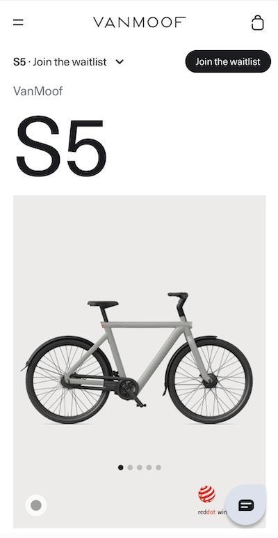
Clean design and ample use of white space are very apparent on Vanmoof's website for their upcoming e-bike. The content of the webpage is simple, effective, and well layed-out. I am not overwhelmed with content, and I can clearly see everything that Vanmoof wants me to see. Creating a minimal, clutter-free page can effectively convey the intent and function of a page.